Corporate Identity
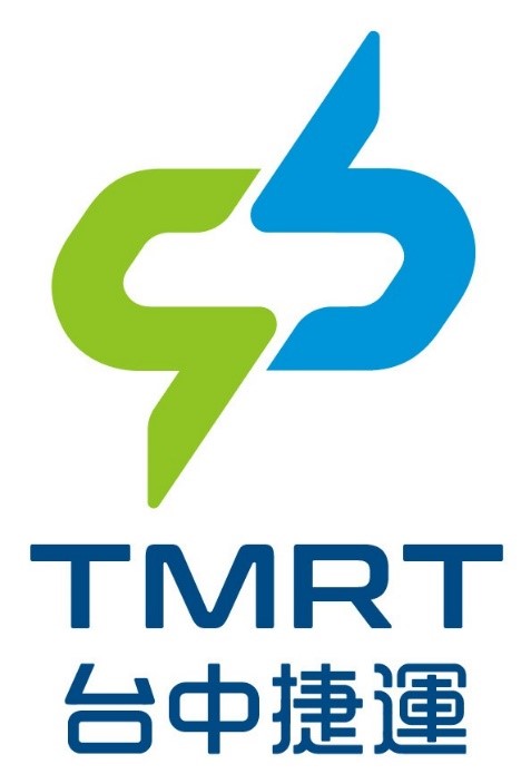
This logo is Chinese characters '中' as the principle axis using sharp lines to represent the speed and convenience of TMRT.
The upper right blue line will be used to symbolize Taichung as a city surrounded by rivers with potential of connecting international harbors. The green line on the bottom left symbolizes environmental protection, displaying one the TMRT’s characteristics. The red lines at the top and bottom combine and form the shape of a train coupler, the connecting cabins portraying the connection of happiness between people and their communities.
The English abbreviation TMRT comes from T representing Taichung and MRT as the preferred internationally recognized name for the transportation system allowing international visitors to easily understand.